Bracelet Club
What’s the first rule of bracelet club?
Obviously it’s the opposite of Fight Club – it’s tell everyone about bracelet club!
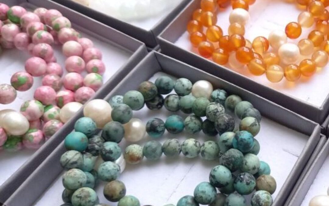
Bracelet Club – I really do love it. I love selecting the stones from reputable dealers that I’ve had relationships with for years. I also love making the bracelets, the mindful task of stringing the individual beads, then tying all the individual knots, with my own special knotting techinuque that I’ve honed over 3 decades.


I’m super proud of the fact that the knots very rarely come undone, or out of their special hiding place.
In fact, sometimes people pop them back in to me, if they get caught on something and snap (as elastic is prone to do sometimes, I might be good at tying knots, but the elastic is only as good as the elastic industry can provide, I’m not a magician)… but when that happens I generally have to drill out the knot from the hole in the pearl – yes, they’re THAT SECURE.
Often I have feedback along the lines of – ‘this is the bracelet I didn’t know I needed’, or ‘such a great help with my mood’ and it’s truly wonderful to hear.
But don’t take my word for it, the reviews on the website will tell you in words that mean much more. Thanks for all your reviews, please do keep them coming. It means so much to me, and it also helps with the website visibility too and all the techy stuff.