by Athene Sholl | Feb 5, 2018
My Own Personal Rainbow – Why do we sometimes become so staid in our choices of colours? Some colours are obviously more wearable than others, depending on our skin tones, hair colour etc, but many of us covet colour and never wear it, are we missing the benefits, the mood enhancing value of an uplifting shirt, dress or tie? Or even a notepad, a coffee mug – we don’t always have to wear it. This can have an effect on those around us too, not just on ourselves. Don’t we owe it to ourselves and society to take steps to boost our mood with our palette when we get dressed, and present ourselves?
For this project I’ve decided to go old school and work in a sketchbook, using pens, scalpels, glue and photocopied images. No digital here, I’ve taken photos and made studies of the colours, then used those images to directly translate into the necklaces. I do usually use precious metals in my work, but simply for their colour – precious and semi precious stones are hard to beat. 3D artists still need a grounding in 2D, so I usually start with colour images and build up from there, but I rarely sketch in 2D, I usually prefer to make models, but for this project I again found myself just using the pictures as a kind of palette. Something that I’ve done for a few years subconsciously, and in the last three years I have made a feature of. I originally wanted to explore the use of colour and how it, along with texture, changes our perception of objects. I found, however that it became much more personal than that. I’ve been inspired by my own art education, starting with Miss Rabey at the Girl’s Grammar school in 1984. I wanted to go back to my childhood and look again through that same prism, to see if I could get to the base of my colour perception, and how it set me on my journey. My own colour theory.
This exhibition presented the opportunity to really examine my own response to colour, and along the way it bought up a few things that I’d previously not considered fully. I worked in a fashion boutique as a teenager, and during my University years, immersed in fashion as much as you can be on an eternal students budget. Colour had always been a large part of my College work, and when I finished college and started to market my work, I quickly realized that although colour attracts lots of attention, it doesn’t always sell. There is an established commercial path, via websites, galleries, stalls and events, even etsy shops, where I’ve found this to be true. Exhibitions allow a certain sense of freedom from the constraints of selling my work, so it’s always a welcome medium in which to have free rein. I love to use sparkle in my work, but subtle colour is what sells.
As a visual artist I’m always fascinated when people ask the question “Where do you get your inspiration from? “ I want to say, “Step outside and look around you.” (Actually I see colours when my eyes are closed, and I often dream in colours, but I digress). At this time of year how can you fail to help but notice all the colours, and the new shapes emerging? How can you not be inspired by nature’s amazing and beautiful combinations? Green leaves against a blue sky. Yellow petals against brown earth. Greenery was the starting point for this. Looking out of the window at the start of the project back in February. And realizing I was responding to colour in a certain way. Why do we do this, here should come the science, but instead I’ve decided to be more personal that that. Ultimately the way we process colour is completely personal and individual, scientifically.
We have certain ingrained responses to particular colours, red=danger, Green makes us feel clean, new fresh, synonymous with new life and spring growth. I wonder how much of the effects of colour can be political, party colours, football colours, school uniform colours. Even red lipstick during the war years.
The background picture to many of these colour studies is a sunrise I photographed from my house in January 2016, which has influenced so much of my work in the last 18 months. Containing purple, pale prison pink, baby blue, the new black, safe navy, fiery red and yellow, as well as greys. Absolutely all my favourite colours – but no sign of greenery. That new usurper. No wonder I love to gaze at this photo while I work. I’m looking at my life illustrated in colour. All these colour studies, the essays, had been already completed, before I put the sketch book together, but I realize this for absolutely the first time only as I type this, my stream of consciousness that has been committed to type on 13th May 2017. This first essay, my personal rainbow, has been written as a post script to the rest. So how is that possible that I only see that now, that I only just realized that all these colours are present in that one photo that I love so much? I genuinely can see all those colours in the picture, together as if for the first time. But they are all my own colour history, my personal journey through colour theory, my own made up version of colour theory. This is what I realize I’ve learned through the 33 years since that very first colour theory lesson in the sunny art studio with Miss Rabey in September 1984.
The whole circle of the rainbow seems complete, my own personal rainbow.
This essay was written as a part of our colour theory essay collection – to read them all click here. We have also had the pleasure of being involved with exhibitions where we have displayed our colour theory work such as Perceptions 2017 at the Harbour Gallery in Jersey.
by Athene Sholl | Feb 5, 2018
Funny that I don’t think of grey, but greys , in the plural
And amazing how much there is to be seen in greys. All the facets and nuances that go together to make up the simply staggering varieties of this lovely, calming and absorbing colour range. Soft greys, harsh greys, blue greys and green greys, those fashionable Annie Sloan paint colours that everyone suddenly had in their house. They really do provide a foil for everything, they make everything look so modern, despite firmly remaining a historical palette. Funny that – perhaps again a fabulous sales pitch? Grey with a bit of something underneath to lift it up, like the Dulux hint of colour white paints from my childhood. Apple white &Co. Now we have warm greys. Or maybe greys really are the go with everything, make everything look fabulous wonder colour that the new black could have been. Except nicer and easier to wear, more forgiving and more gentle. Still as smart, still corporate even, if you’re that way inclined.
I live in grey clothes, when I’m not wearing colours and don’t want to have to think too much, or to respond. When I don’t want to be distracted. Soothing and dependable, like a cup of tea.
Grey clothes are my go–to for smart, seeing as I can’t bring myself to do black.
The whole collection of colour theory essays can be found here.
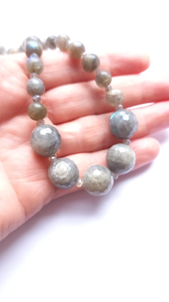
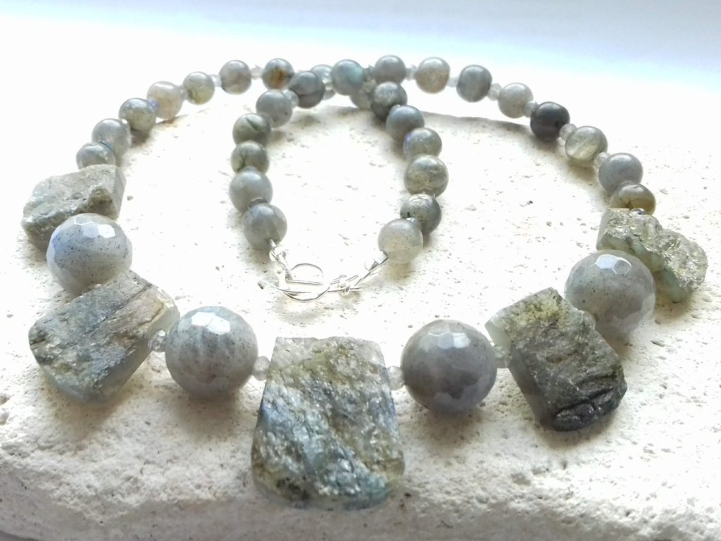
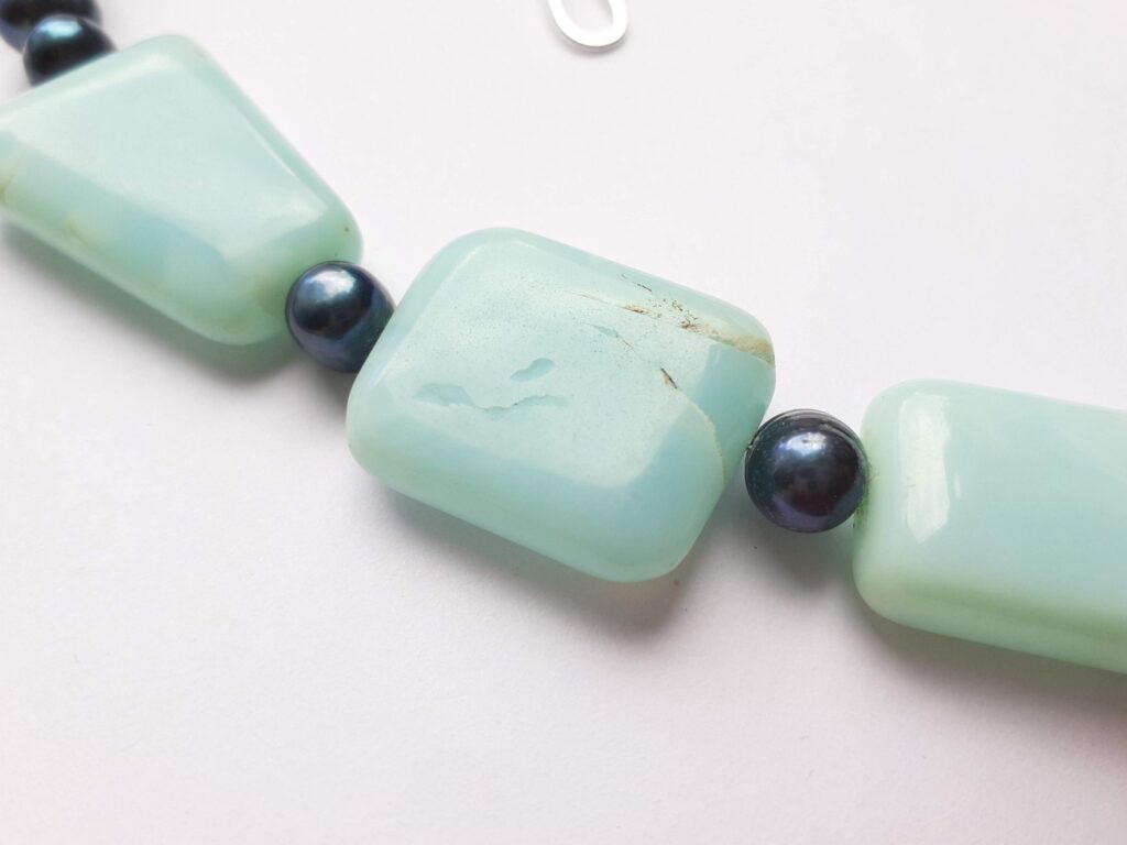
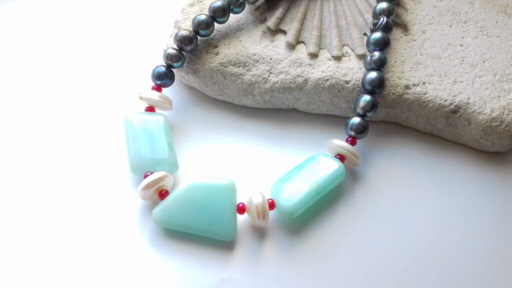
Grey Necklace. Grey Labradorite slabs with faceted and polished labradorite beads. Sterling silver handmade clasp. Approx length 18′
< Previous Colour Theory Essay
by Athene Sholl | Feb 5, 2018
Fiery Red and Yellow. Primary, heartstopping, but of course, this isn’t just one colour, and like the new black, it doesn’t really exist. All in my head, but that’s the point, it’s my version of the colour, or the combination of colours that go to make this up.
Ooh and look, I managed to sneak a bit of orange in there too, just because I felt like it, and looked back at the picture and then felt validated.
These colours are just made to go together, always linked by the use of fire, that most primeval and basic element. Man must always have loved this colour combination, the comfort that it brings, and also power. There’s no surprise that red is a powerful colour, it’s the ultimate power, Fire.
And yellow and orange just tag along behind…in my head.
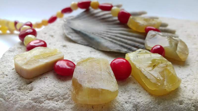
This fiery red and yellow necklace is made from 5 chunky opal slabs with red bamboo coral beads and smaller opal beads. The necklace fastens with a handmade sterling silver clasp. It is approximately 18″ long.
< Previous Colour Theory Essay
Next Colour Theory Essay >
by Athene Sholl | Feb 5, 2018
Santorini sea, Guernsey Sky, my grans’ old teapot. Such things make me happy, and thus Baby blue is a favourite. For no other reason than it reminds me of happy places and happy times.
The funnel neck jumper that I once blew a weeks wages on (Nicole Farhi, always a fave) and then wore for an entire long weekend trip with friends to Cambridge. I had a great time, and slept in my jumper, thus Imbuing it, and the weekend AND the colour with a mythical quality. Like a lucky charm. Poor old jumper, I still have it, and I wear it when I’m poorly to make myself feel a bit better. My Dad did the same, he had a sick jumper, that we all mocked. I wonder if it reminded him of a happy time? For me it’s the colour and the comfort of the colour, all tied up together.
In the Princess Elizabeth hospital, delivering my firstborn, with the help of a bit of diamorphine. Incredible stuff…I flew off down into a lovely electric blue tunnel. It was bliss. Although something that I’ll hopefully never repeat. Don’t really want to make a habit of such things. Incidentally, I delivered the second with a bit of gas and air, which my husband also had a go on – just to be social.
My current and favourite ever sunnies – in electric blue. Permanently on my head, I love the fact that they are so cool and everyone else loves them and comments on them. I would if I saw them on someone’s head. They look like flies eyes. Amazing blue ones.
That gorgeous blue palette of swimming pool tiles. I swim loads – several times a week, I find it enormously grounding and calming. I can think in a pool when I feel overwhelmed and unable to think outside of it. I head to a pool when I feel a need to think or whenever I have lots on. Perhaps it’s the monotonous up and down, or the endorphins of the work out of half a mile of front crawl, but I rather prefer to think it’s the colours. Ideas come to me in a pool – it’s just a shame pen and paper are never handy at the same time.
Baby blue / electric blue…all my favourite things. Blue is meant to be cooling and calming, offering no stimulation. But in my personal colour diary in my head blue is anything but.
< Previous Colour Theory Essay
Next Colour Theory Essay >
by Athene Sholl | Feb 5, 2018
Purple
I loved purple as a teenager, I wonder if I still could?
Looking back, purple was possibly my first obsession. An all consuming, head over heels, proper colour crush. Although I think I took it a bit too far.
Clothes, food, music. Smoke on the water…I learned to play it just so I could be closer to purple. Ye gads, did I really do that? Does your own teenage self make you cringe too?
Oh how I loved purple, I was the purple one. I had purple everything. I wore purple clothes, I wrote with purple ink (yes, really) I ate parma violets at every given opportunity, I even wore a perfume with a purple bottle that smelled of parma violets. I also actually painted the flowery purple logo from the bottle on my bedroom wall, four feet across. In purple emulsion. What possessed my parents to allow that? I think I’d just started at art college, painting on the walls was de riguer.
I was known by some of my friends as “er in the purple”. I completely immersed myself in the colour and absolutely couldn’t get enough of it. My purple safety blanket. I even once begged a purple cardigan from someone I hardly knew, just came right out and asked her to give it to me when she decided she’d had enough of it. Pretty please. She did. Result!
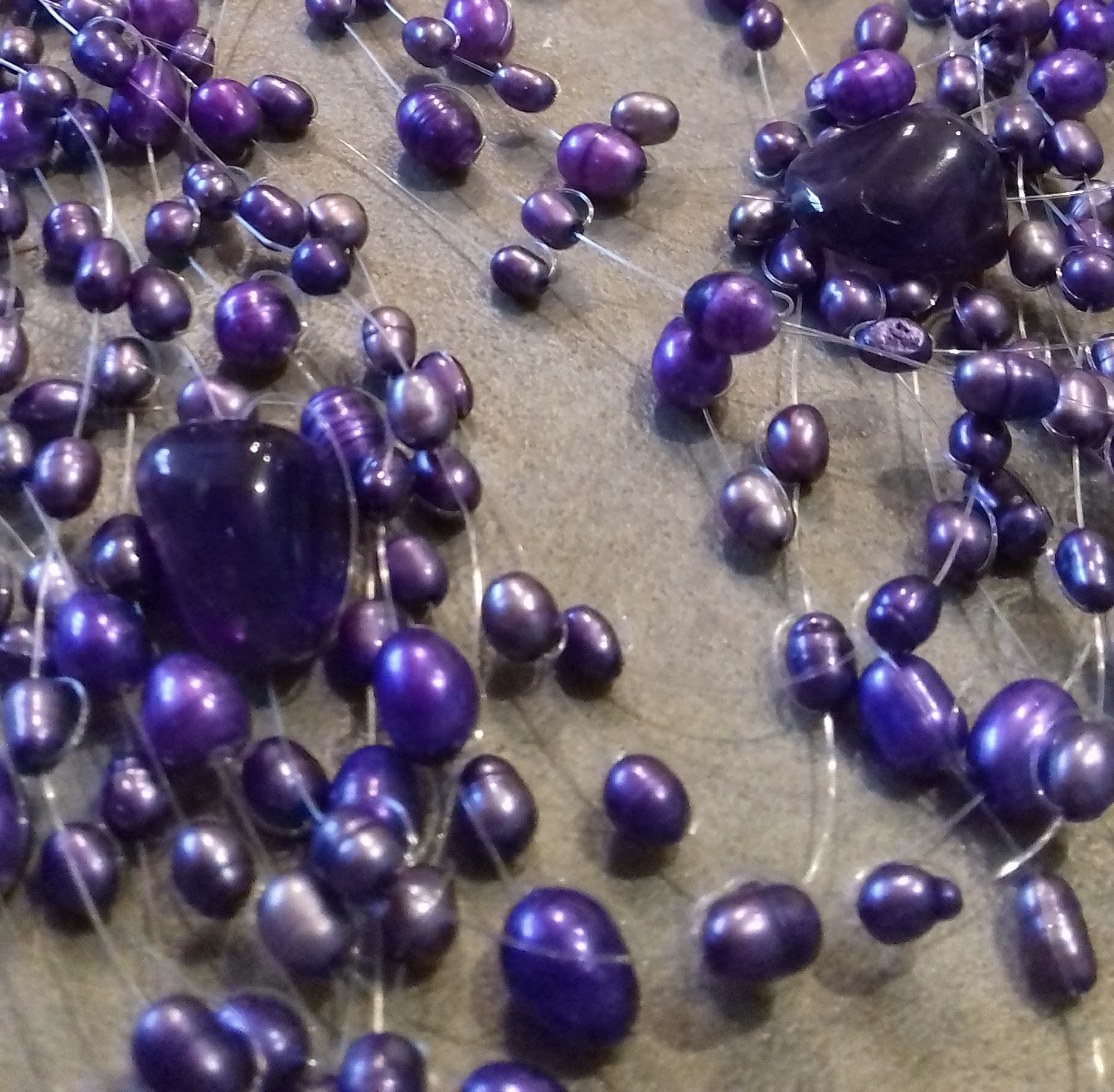
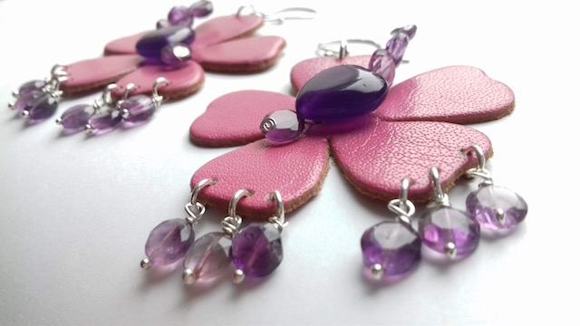
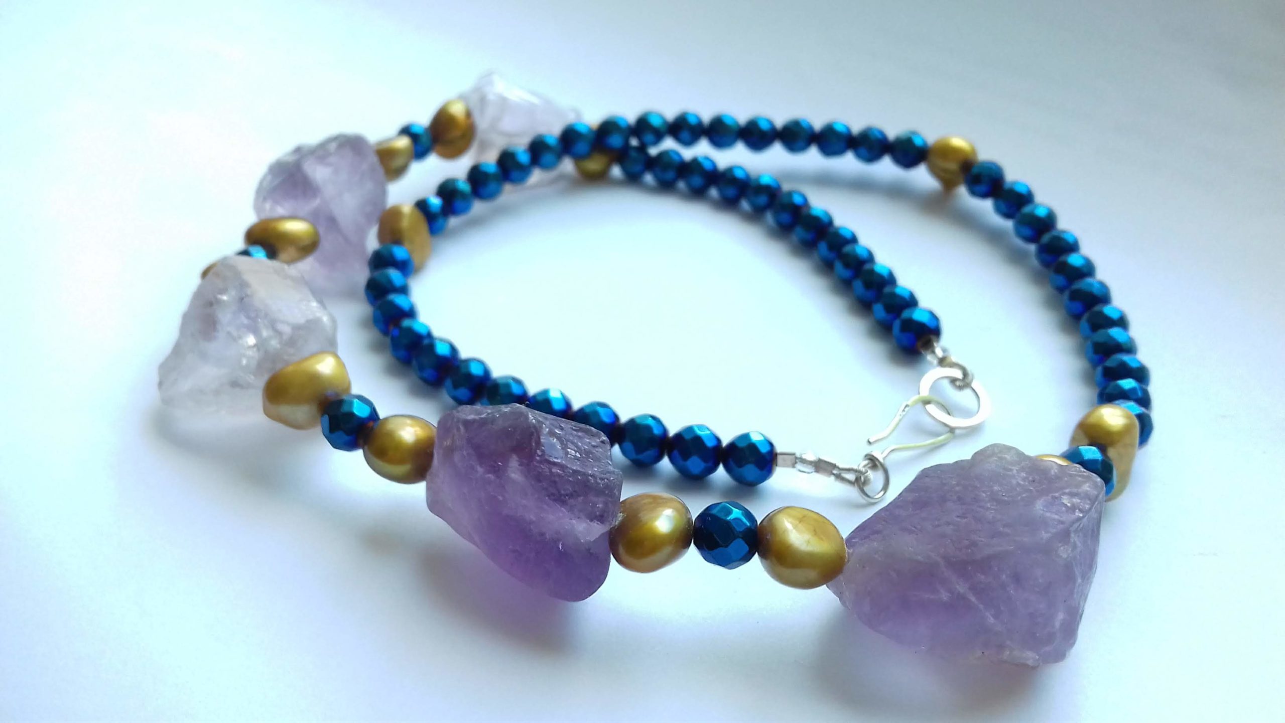
I also had a lovely amethyst brooch, shaped like a flower (it was the eighties, I’m forgiven). Amethysts – those gorgeous purple stones. They come in many different shades, ranging all the way through to the clear pale green of prasiolite. But the most popular shades, the ones they are most known and loved for, are the lavender shades, from proper purple through to palest lilac.
As a teenager purple always made me feel warm and safe. It might even have started with that amethyst brooch, worn mid eighties Madonna style, pinned over the lace on my customised denim jacket from Gabriels. Next to my CND badge and the one the Tufty club sent me. Oh dear, open the floodgates, here it comes, the nostalgia. I hadn’t thought about the Tufty club for fully three decades, now purple has released the memories again. ROSPA – the road safety society, was relaunched in 1979 with a new mascot, Tufty the squirrel. We must have signed up in school or maybe in brownies, but life time membership of the Tufty club has stood me in good stead, road safety wise.
So purple is my route to personal nostalgia, how we love to wallow in it. Perfect therapy, writing about colour. I loved that brooch so much, it might have been bought with my first teenage pay packet, from picking carnations in a sweltering greenhouse. I lasted all of two days in the job, but the brooch has lasted so much longer. I wore it until most of the stones had fallen out. But I’m such a hoarder, it’ll be here somewhere I’m sure.
After I realised I loved the amethysts enough to gaze at them all day, purple fully sucked me in, but then the purple vortex properly consumed me. If it wasn’t purple I didn’t want to know. It carried on well into my sixth form and early college years, fabric printing for making my own clothes and crocheting king sized purple bed blankets, all of which I still have, natch. Then one day I realised…bummer…this colour just does not suit me. And I simply stopped wearing it. But I also went off the colour totally, and even turned my back on amethysts. How foolish. It seems like a million years ago now, when I woke up and had the purple epiphany…time to move on with real life. Time to grow up. But looking at the P word now on the screen, writing this, it still somehow looks a bit naff, I well and truly ruined it for myself by allowing it to be all pervasive. Just like the time I ate two litres of salted peanuts, threw up and ruined them for myself forever. I was ten. Again, how foolish! It was a long time before I could eat peanuts again. Maybe revisiting purple after so much water under the bridge has enabled me to look at purple in a different light again. Now enough time has passed that I love the colour again, and I love working with amethysts, but not quite enough to wear them.
I never threw up from too much purple, but I’m sure people around me in my teens felt like they would from being in such close proximity to everything purple. I’ll have to ask my sister. Now that I can safely say I’ve matured in my colour relationship with purple, and left my teens behind, I feel like I’ve finally grown up.
Now, where’s my tufty club badge?
< Previous Colour Theory Essay
Next Colour Theory Essay >

